At the center of mobile app development, there is one often-overlooked factor that quietly shapes our digital experiences - Information Architecture (IA).
It's like a compass that guides users through an intricate maze of buttons, screens, and menus, providing them with an enjoyable journey.
But what's the buzz all about? Well, that is exactly why we are here to help you discover!
Imagine your mobile app as an incredible skyscraper that stands as an emblem of creativity and innovation.
Now, what's the one thing you absolutely need to ensure this architectural marvel's stability and success?
A solid foundation, right? Information Architecture UX is that foundation. It's the blueprint that architects the layout, the pathways, and the structure of your app.
But in an ever-evolving app development landscape, we require more than a strong base. We require a strong framework that can expand, adapt, and scale with our business: a Scalable Information Architecture!
In this article, we've unveiled the strategy of crafting a Scalable Information Architecture UX in 2023 for your app’s success.
So, what’s at the core of Information Architecture?
Imagine it as the framework that organizes and categorizes all the content within your app.
Just as a library organizes books by sections. Architecture Information specializes in organizing your application’s content into separate compartments.
Information Architecture UX ensures that each piece of data has an easily accessible location, making it simpler for users to locate what they require within the app.
Imagine walking into a library where books were scattered randomly on shelves without labels.
Would it ever be easy for you to locate that perfect book you’re looking for?
Information architecture is the librarian who organizes them neatly onto shelves with clear labels.
Hence, this way, you can locate exactly that one book that interests you.
But wait, there’s more to it!
IA goes beyond simply organizing things neatly; it also involves designing an intuitive navigation system with menus and buttons to ensure your users can seamlessly use your app.
Information architecture’s job also lies in designing these pathways so users can navigate easily throughout your app.
Imagine having road signs guiding your way effortlessly around an unfamiliar city and helping ensure that you won’t end up lost!
That is what a well-designed IA does for your app: it ensures your journey remains on schedule without becoming disoriented along the way.
Let’s briefly touch upon user experience (UX). IA and UX go hand-in-hand.
An effective IA can significantly elevate the experience of using your app for users. It reduces frustration, keeps users engaged, and eventually ensures their return.
Imagine sitting behind the wheel with an intuitive navigation system that knows all of the shortcuts, as well as suggesting places you must visit.
This is what an intelligent Information Architecture (IA) does for an app!
Now, let’s make sure we all understand Information Architecture more clearly!
Uber app serves as an outstanding example of IA in action; when opening it up, you are welcomed by an intuitive interface that is clearly laid out.
An IA is designed to make finding rides much simpler; just type in your destination, view available rides, and track your driver!
Uber ensures a hassle-free and intuitive travel experience from start to finish by offering rides at all levels and times of day and night, including during weekends and holidays.
Imagine an app that leaves you perplexed, providing no clear path towards reaching your intended goal.
Chances are, you won’t stay around long. That is why Information Architecture (IA) is essential - keeping users engaged can lead to increased retention rates and satisfaction levels.
Thus, Information Architecture serves as the cornerstone of mobile applications by orchestrating content, navigation, and user satisfaction.

Now that we understand Information Architecture (IA), let's dive deeper into its principles.
These principles serve as the fundamental pillars to make sure your IA design stays on course and delivers optimal user experiences.
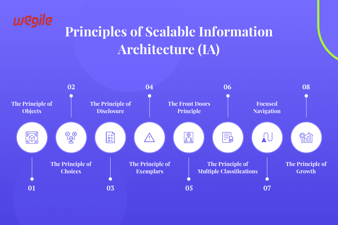
In Information Architecture (IA), every piece of content or functionality should be treated as an object that serves a clear, well-defined function for your application, like fitting puzzle pieces together perfectly!
Your users shouldn't feel overwhelmed with choices in an IA.
You should provide options in an easy-to-navigate and manageable fashion, like ordering at a restaurant, with only a few choices but enough variety to suit different palates.
Information in the app should be revealed progressively to avoid overwhelming users with data and prevent user disengagement.
Think of peeling an onion; layer upon layer should be gradually revealed so as to keep users engaged without overloading them with too much information at once.
This keeps users engaged while simultaneously limiting information overload.
Present examples to your users to assist their understanding while they access your app.
Much like clothing stores display outfits on mannequins, your app could display exceptional content or actions to assist users and show examples for them to refer back to later on.
Not all users enter your app through its main page. Therefore, architecture information should offer multiple entry points.
It's similar to the side entrances of a house, so users can quickly gain access to what they require.
Don't limit yourself to just one method for organizing content.
Your users might have different mental models of accessing similar material - just as road signs point toward their destination in an urban environment.
Provide your users with multiple paths that lead directly towards it so users have a smooth user experience.
To keep navigation clear and straightforward, avoid too many detours or dead ends - like driving on an expressway with well-marked exit signs.
Your IA should be fluid and adaptable. Just as cities grow over time, so should your app accommodate new content without creating chaos or disarray.
Now, let's put these principles together - these components form an IA that feels like a concerto!
Imagine you are planning an elaborate dinner party, with various courses carefully organized so they complement one another for an exquisite dining experience.
By applying these IA principles in digital environments, you are effectively designing an intuitive app.
This way you’re ensuring an app interface, where users can navigate easily while discovering content intuitively.
Now that we understand the fundamental principles of Information Architecture (IA), let's examine its core components.
These components are like building blocks for a soaring skyscraper - so your mobile app can reach new heights without crumbling under its own weight. Let’s have a look at them!
In the same way, an IA can ensure each piece fits neatly within one or more well-established sections of the app!
Imagine that your app's content is like an immense library. In this library, various genres are arranged into categories for easy user navigation.
For instance, a news app may group articles into political, sports, or entertainment topics. This way, users are able to quickly locate what interests them without wading through pages of irrelevant info.
Your app's navigation system serves as its GPS. Therefore, it should be user-friendly and intuitive, seamlessly leading users to their destination with ease.
Consider clear labels, hierarchical menus, and an uncluttered interface as ways of improving the app's effectiveness.
Now, imagine that you’re driving through an urban city with well-marked road signs - that's the kind of guidance your app’s IA will offer its users!
Search is often a key feature that your users will look in your app for when they need something quickly.
An IA that incorporates robust search features allows them to locate particular pieces of content or features quickly.
Think of the search function as the index in a book!
The first and foremost thing your IA should prioritize in your app is the user's needs and preferences.
Conduct in-depth user research in order to gather more insight into user behaviors and expectations.
Make use of user-centered design methods so your app aligns with how its target market interacts.
Just like a well-structured building stays intact in all weather conditions, an IA must also remain consistent and adaptable over time.
A scalable IA should accommodate these changes without becoming overwhelming for its users.

Designing a solid Information Architecture (IA) for your mobile app is like constructing a well-organized city.
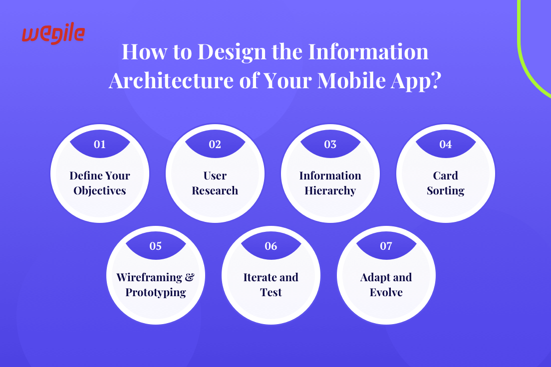
Every street, building, and signpost must serve a purpose and lead users to their desired destinations. Let's break down the IA design process into a detailed, step-by-step guide:
Before embarking on your journey in designing the Information Architecture UX of your mobile app, it's vitally important that you set clear objectives.
Consider what goals your app hopes to meet.
Ask questions like: Who are your target audiences, and what are their unique needs and preferences?
At its heart, this initial phase is akin to setting out coordinates on a map before embarking on any journey.
An IA provides you with a sense of direction, helping you tailor your IA to meet the goals and expectations of your app specifically.
It's just as knowing where you're heading towards ensures a more pleasant journey.
Undergoing extensive user research can help you craft IA designs that best address its target audience. It is a key consideration for creating successful designs of any IA system.
Gaining this insight is paramount if you wish to craft effective IA designs tailored specifically for them.
Employ surveys, interviews, and usability testing as tools for gathering insights.
It's like asking locals for directions when visiting an unfamiliar city. It's because they have first-hand knowledge of any shortcuts or hidden gems as well as effective routes across the terrain.
In the same way, user research provides you with all of the knowledge necessary to design an IA that leads users directly to their desired destinations within your app.
A key part of IA design involves developing an information hierarchy.
This hierarchy can help you prioritize content and features according to their significance, relationships with each other, and potential risks they pose for visitors.
Imagine organizing items on store shelves; those most requested should be easily reachable and at eye level.
Your IA should ensure that users can easily and quickly gain access to content or functions they find essential.
Designing an app around your user needs and expectations means ensuring their app experience is an effortless and harmonious journey.
Card sorting is an efficient method for organizing content logically within an IA.
Assimilate user feedback in order to categorize and structure information effectively.
Consider it like piecing together a puzzle - place elements strategically so they make sense for users.
Card sorting ensures your IA aligns with how your target audience perceives and navigates information, creating a user-friendly and intuitive experience for your app users.
Once you understand how users naturally categorize and access information, you can tailor your IA so it aligns with their cognitive frameworks- improving the overall usability of your mobile app.
Wireframing and prototyping are key steps in the architecture information design process, offering visual depictions of your app's layout and navigational elements.
These blueprints serve as architectural plans, providing users with a detailed picture of how they will engage with your IA.
As with architecting, these wireframes and prototypes help map out user journeys within your app to ensure an enjoyable user experience.
Sketches provide the foundation of any IA design, helping you visualize and revise its structure before its actual implementation.
Iteration and testing are integral parts of IA design. Once an initial version of your IA has been developed, gathering user feedback and input is vital to ensure the app's effectiveness.
This feedback loop ensures that your IA aligns more closely with user requirements and preferences.
Imagine taking your vehicle out on test-driving to optimize its ride for comfort. Make necessary adjustments as per your need so as to achieve smooth sailing.
User testing enables you to identify pain points and usability issues so you can refine your IA for maximum user satisfaction.
An iterative process ensures that your IA adapts and transforms in response to user demand and mobile app development trends.
A dynamic IA isn't static. As your app expands with additional content or features being introduced, its IA should adapt and evolve accordingly.
Imagine renovating your house to meet the growing needs of a growing family. In much the same way, IA should grow and adapt as your app's needs do.
Your IA should remain user-friendly over time to avoid user confusion and dissatisfaction. With its flexible nature, adaptable interfaces help ensure efficiency without confusing users further down the road.
Future-proof your IA so it can expand with your app's growth while accommodating changes and providing users with a positive user experience.
Hence, Flexibility and adaptability are keys to long-term IA success.
So here we end with an insightful guide on Scalable Information Architecture.
As we traversed through the vast world of IA, you have gained insights into its core principles and how you can implement a user-oriented IA for your app.
Remember, IA is more than just a framework; it's the key to unlocking exceptional user experiences.
By prioritizing user needs and adopting IA principles, your chances for success in mobile app development can increase significantly.
Reach us, Wegile, as here we will assist you with building mobile apps that not only meet user expectations but exceed them!


 Browse Our Services

Interested in working with us?